Introduction to the Paramount Network Logo
The paramount network logo is not just a visual element; it embodies the essence of the brand, reflecting both its history and ambitions within the entertainment industry. This article delves into the intricacies of the Paramount Network logo, exploring its historical evolution, design elements, and significance in establishing a distinctive brand image in a competitive landscape.
History and Evolution of the Logo
The Paramount Network logo has undergone significant transformation since the network’s inception. Originally launched as Spike TV in 2003, the rebranding in 2018 to Paramount Network marked a pivotal moment in its logo design. This transition aligned with the network’s focus on creating premium scripted content, a departure from the more edgy programming of its predecessor.
The evolution of the logo illustrates the network’s commitment to quality and sophistication. The original Spike TV logo featured aggressive typography and iconography conducive to its programming style. In contrast, the new logo harmonizes simplicity with elegance, embodying the classic Hollywood aesthetic that Paramount Pictures, its parent company, is known for. The logo underwent several iterations, culminating in a clean design that features the iconic mountain graphic and refined typography, signifying the brand’s aspiration to rise above its competitors.
Key Features and Design Elements
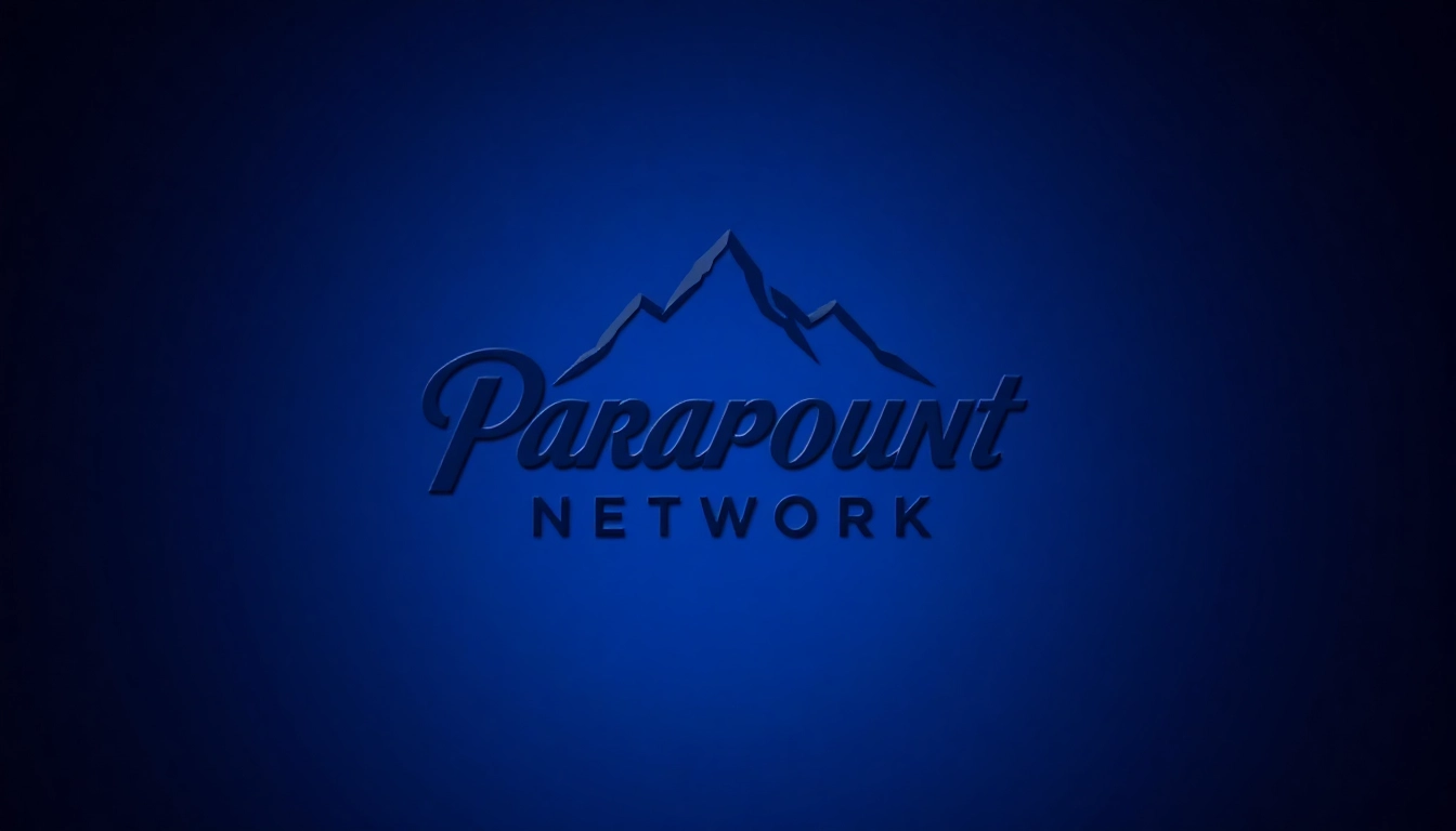
The Paramount Network logo’s design consists of essential elements that contribute to its visual identity. At the core of the logo is the mountain graphic, a direct reference to the iconic Paramount Pictures peak. This mountain is rendered in a stylized way that evokes a sense of authenticity and timelessness, reinforcing the brand’s heritage.
The typography complements the graphic with a modern sans-serif typeface that balances tradition and contemporary design principles. The overall simplicity of the design facilitates recognition and recall, key elements in building a strong brand identity.
Visual Identity and Recognition
Color Palette Analysis of the Paramount Network Logo
The color palette of the Paramount Network logo plays a vital role in conveying the brand’s personality. The primary colors used are shades of blue and white, projecting feelings of trust, calmness, and reliability—qualities that resonate well with viewers seeking authentic storytelling experiences. The blue hue is reminiscent of the sky, symbolizing limitless possibilities and the vastness of storytelling potential.
Moreover, the mountain is often depicted with a gradient, enhancing its depth and dimensionality. This choice of color not only adds a modern touch but also encourages emotional engagement, inviting the audience to connect with the narratives presented on the channel.
Font and Typography Choices
The font choice in the Paramount Network logo is crucial for its overall appeal and functionality. The sans-serif typography instills a sense of modernity while remaining rooted in classic design traditions. The font is easily legible at various sizes, ensuring that it maintains its impact across digital and print media.
Through the use of bold and simple lettering, the logo communicates strength and clarity, making it easily distinguishable among competitors. This typographical choice reflects the brand’s commitment to delivering high-quality content while maintaining a user-friendly interface across various platforms.
How the Logo Enhances Brand Recognition
The Paramount Network logo is designed for high recognition, which is critical in today’s media landscape saturated with content. By creating a visual identity that is both distinct and memorable, the logo fosters strong brand recall among audiences.
Consistent usage across all marketing materials and programming promotes familiarity. This consistency helps in building trust and loyalty, encouraging viewers to choose Paramount over other networks. Its well-thought-out design also allows cross-promotion opportunities, where viewers can identify the network’s branding effortlessly across multiple platforms, enhancing overall viewer engagement.
Comparative Analysis of Competitor Logos
Trending Designs in the Entertainment Industry
The entertainment industry has seen a myriad of logo designs, from complex illustrations to minimalistic logos. Recent trends lean towards simplicity, focusing on crisp lines and clear typography to create lasting impressions in a digital-first world.
Networks like HBO and Netflix exemplify this trend, opting for bold typographic logos that are impactful and easy to recognize. Such designs resonate with audiences accustomed to quick consumption of content, facilitating immediate recognition and brand association.
Lessons from Competitor Branding Strategies
Brands like Hulu and Amazon Prime provide insightful learning opportunities regarding the power of strong visual identities. By examining these competitors, one can deduce that simplicity in logo design allows for versatile usage across various digital platforms.
Moreover, effective competitor branding strategies emphasize flexibility—adapting logos for social media environments while maintaining core elements that ensure brand cohesion. This adaptability is essential for staying relevant and approachable in an ever-evolving entertainment landscape.
How Paramount Network Stands Out
Amidst a sea of competitors, the Paramount Network sets itself apart with its rich legacy tied to iconic Hollywood imagery, captured through its logo. While many contemporary networks favor straightforward typographic representations, the integration of a distinctive mountain graphic allows Paramount Network to evoke a deeper narrative that speaks to its storied history in filmmaking.
This unique trait not only captures attention but also forges a connection with audiences who have long been associated with the Paramount brand through cinema. Such an approach helps the network position itself distinctly within the crowded entertainment marketplace.
Impact on Marketing and Audience Connection
Effective Use of the Logo in Advertising
The role of the Paramount Network logo in marketing campaigns cannot be overstated. Employing the logo strategically in advertisements enhances brand visibility and reinforces brand identity across diverse media channels—television, digital, and print.
Additionally, the logo serves as an anchor point in promotional materials, allowing potential viewers to associate the logo with the kind of premium content that the Paramount Network offers. This visual association is critical in a competitive environment where viewers are inundated with choices.
Logo’s Role in Audience Engagement
The engagement of audiences through logo use extends beyond mere visibility; it encompasses emotional resonance. The Paramount Network logo encapsulates the essence of storytelling—a journey marked by peaks and valleys, much like the narratives presented on the network.
By tapping into the emotional frameworks of viewers, the logo becomes a conversation starter, evoking nostalgia for classic movies while also promising exciting new shows. This narrative-driven approach fosters deeper audience connection, facilitating fan loyalty and ongoing viewer interaction across social media platforms.
Measuring Brand Perception via the Logo
Understanding brand perception is vital, particularly in gauging how the logo contributes to the overall brand image. Measures such as audience surveys, social media sentiment analysis, and viewer engagement metrics can provide insights into how the logo is received by the public.
By examining associations tied to the logo—such as trust, quality, and tradition—Paramount Network can refine its branding strategies to ensure alignment with audience expectations. Such assessments are crucial in determining the logo’s effectiveness as a branding tool, guiding future marketing decisions.
Future Trends in Logo Design
Emerging Design Principles in Media Branding
The future of logo design within media branding appears to be leaning heavily towards flexibility and digital adaptability. As media consumption shifts increasingly to digital platforms, brands must adopt designs that are easily adaptable across various formats—whether video, mobile applications, or social media avatars.
Current trends suggest that incorporating elements of interactivity and dynamic branding—such as animated logos or adaptable color schemes—will play a significant role in how logos engage audiences. This evolution necessitates designs that can live beyond static imagery, embracing change and embracing viewer experiences.
Predictions for the Paramount Network Logo Evolution
As Paramount Network continues to refine its identity, the potential for logo evolution remains a topic of interest. Future iterations may include adaptations that embrace contemporary design elements, perhaps introducing interactive components or color variations that reflect different programming blocks.
Furthermore, as societal norms and technological capabilities evolve, the logo might adapt to represent broader themes such as inclusion and diversity—integrating elements that resonate with a broader audience spectrum.
Adapting to Digital and Social Media Landscapes
The digital age necessitates a strategic approach to branding, especially regarding social media platforms. With the Paramount Network logo playing a pivotal role in its digital marketing efforts, it is vital to refine its presence across diverse platforms to cater to evolving viewer preferences.
This approach may involve rethinking the logo’s presentation for mobile devices or platforms like Instagram and Twitter, ensuring the logo remains impactful regardless of visual context. An effective digital strategy would not only preserve brand identity but also enhance accessibility, ensuring audiences can connect with Paramount Network no matter how or where they consume media.


Leave a Reply